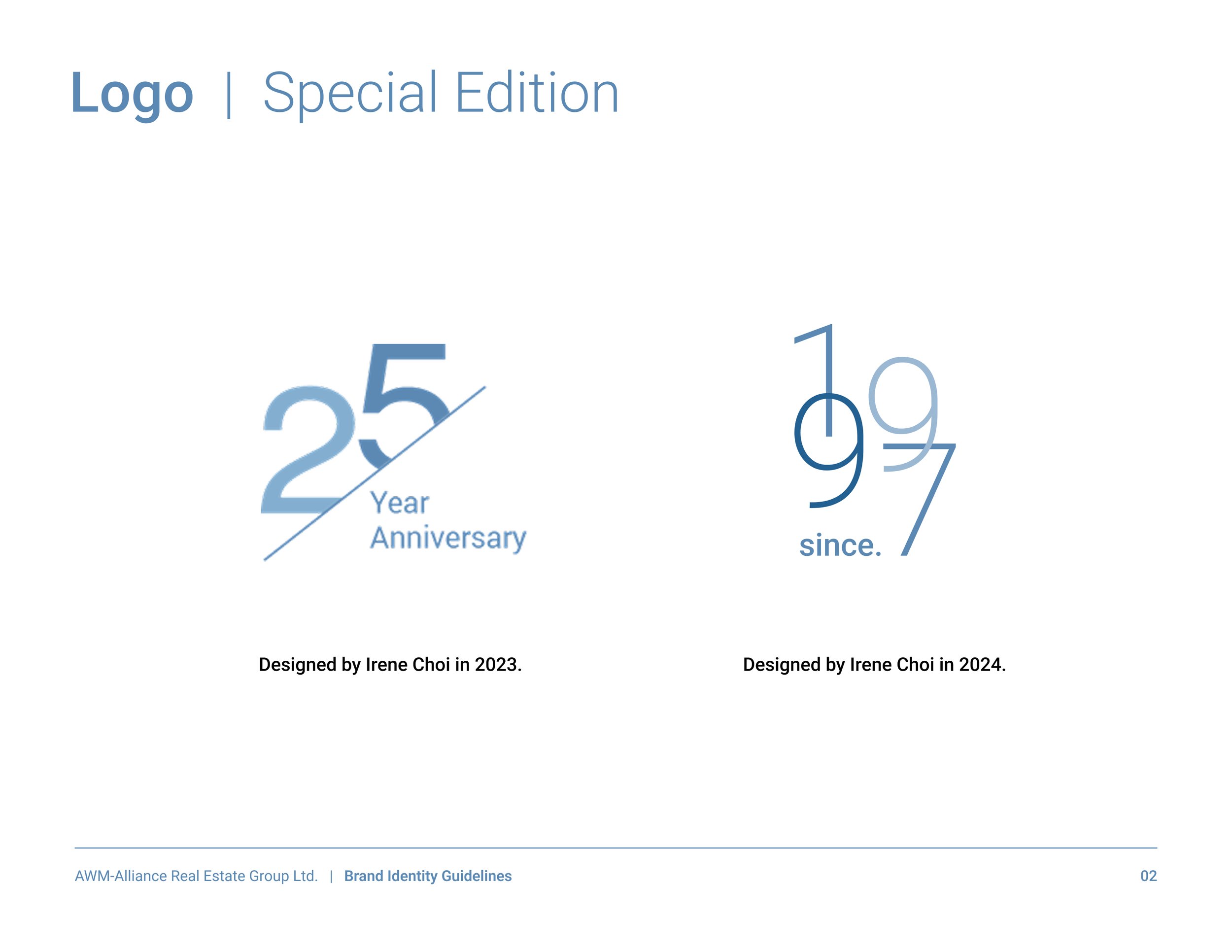
Project Outline
When creating the Brand Identity Guidelines for AWM-Alliance, I considered the limitations of a small budget and the challenge of replacing all physically printed signage across Metro Vancouver. Instead of an immediate overhaul, I prioritized enhancing their design and marketing materials as a first step, ensuring a gradual and sustainable transition.
The client wanted to retain their original logo, which featured an icon representing building windows. However, I refined it to correct misalignment and uneven spacing while preserving its core identity. Additionally, I introduced a modern blue color to replace the outdated silver-black gradient with a 3D effect, giving the brand a more contemporary and polished look. This strategic, phased approach allowed for a cohesive brand refresh that honored its existing identity while setting the stage for future enhancements.